Decals, Ceramic Transfers
- kathrynstevens
- Aug 9, 2022
- 2 min read
Updated: Aug 25, 2022
First of all, working with ceramic transfers is not easy. If they are not right for the piece you can not change them to make them fit or start again. You can not adapt the tone, the intensity or the image, once they have been manufactured they are permanent.
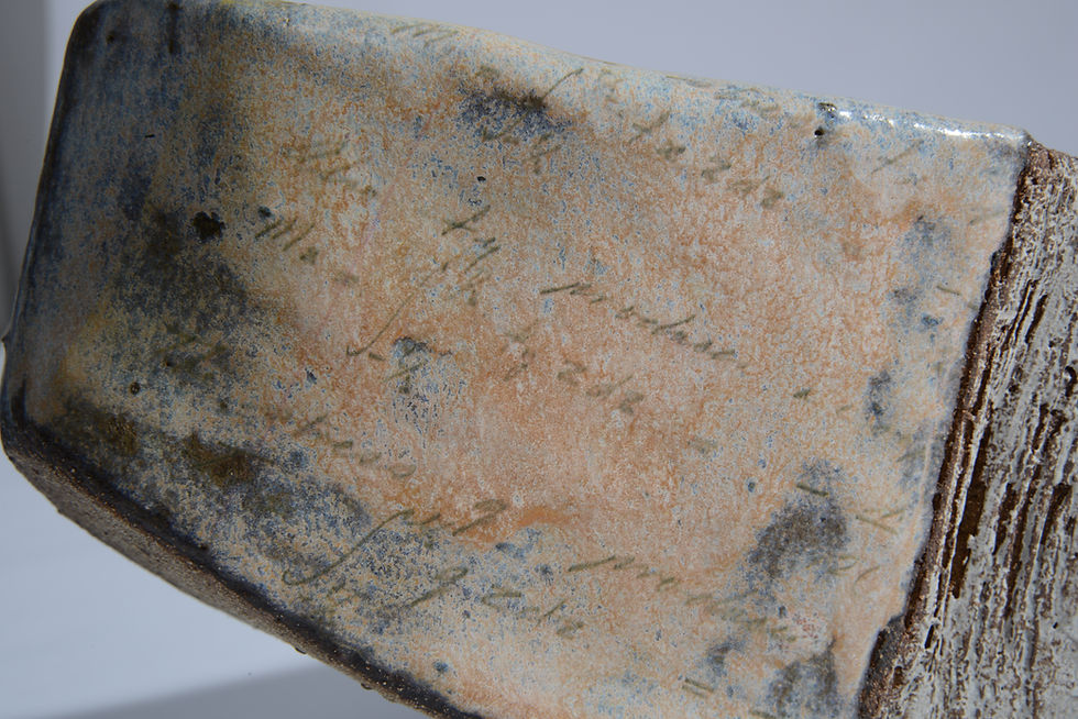
My first test pieces (pictures 1 - 3) were quite successful. The imagery was subtle and not over powering. I sourced some personal pictures and text and arranged for them to be made into ceramic transfers. A lot of pictures were crammed onto one A3 sized paper however this proved fruitless as they did not look right on the work. The transfers were too small for the pieces and too dark. They did not produce the aesthetic I was looking to achieve (pictures 4 - 6). On the flip side I did think the torn and shabby look in picture 7 and the writing based transfers (picture 8) worked a treat and something worth exploring further.
Pictures 1 - 4 (top row l-r), Pictures 5 - 8 (bottom row l-r)


The sheet transfers need to be soaked in water to enable the transfer to be separated from the paper backing. Whilst wet they are then applied to a glazed surface so that they can be fixed to the piece (see pictures below).


For my next pieces I decided to upscale the size of my transfers and to concentrate on text and faint drawings. As the transfers were more subtle, sometimes they got lost on the piece and did not show up against the background of the glaze. Yet another thing to consider. I also used a number of smaller pictures on my medium size pieces but it looked ridiculous and after careful consideration I decided to remove them. Again the writing based transfers even on a bigger scaled worked well. I have therefore decided to concentrate and focus on writing based transfers for my work as a way of sharing my heritage.


Comments